



Olga Bogdanova, 1spin4win: “A slot’s visual identity becomes timeless not when it ignores trends, but when its core remains familiar”
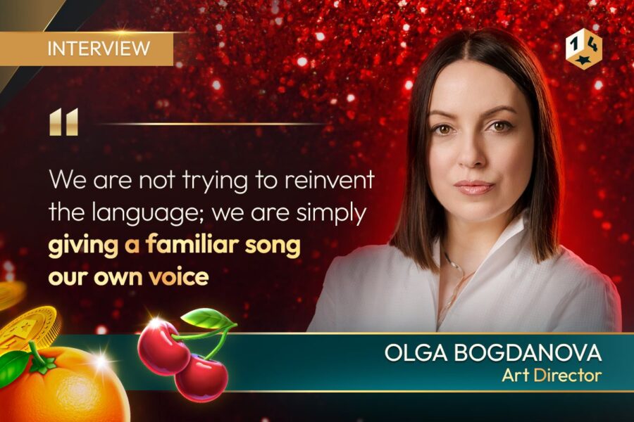

1spin4win’s Art Director explains why familiar symbols, disciplined colour and animation decide whether a slot feels classic or cluttered.
Key takeaways:
- Olga Bogdanova, art director at 1spin4win, says even minor details such as a leaf bending in the wrong direction can weaken a fruit symbol’s visual impact.
- Bogdanova says 1spin4win preserves familiar silhouettes, colour logic and contrast, then differentiates new games through theme, animation, sound and typography.
- Bogdanova warns that a colour palette can become visually overwhelming when every element has the same intensity, even if the individual colours are harmonious.
- Bogdanova expects future fruit slots to favour realistic textures, premium typography, greater immersion and, in some cases, a return to concise minimalist design.
Interview.- Classic fruit slots continue to compete in a market defined by increasingly complex games because their symbols function as a shared visual language. At 1spin4win, art director Olga Bogdanova says the challenge is not to replace familiar imagery, but to reinterpret it through colour, animation, sound and theme without losing clarity. The approach shows how one of igaming’s oldest formats can remain commercially relevant as player expectations and design technology evolve.
What makes a slot visually timeless, and why do classic symbols such as fruit, bells, sevens, and bars continue to appeal to players as igaming design trends evolve?
A slot’s visual identity becomes timeless not when it ignores trends, but when its core remains instantly familiar while the presentation gradually evolves. Fruit, bells, sevens, and BAR symbols work as a well-established visual language. Players do not need to figure out what they are looking at or how to interpret what is happening on the screen. Thanks to their long visual history, these symbols are familiar to players around the world.
What does the art department’s work on a new slot look like from the inside at 1spin4win? Can you walk us through the process, from the initial concept to the final design?
At 1spin4win, the art department follows a coordinated and creative process built around several key stages. We begin by studying the market and developing the game concept, then create a prototype based on established visual references. From there, we refine the design to better match the target audience.
The final and very important stage is animation. Its role is to bring the original concept and the visual design together and strengthen the overall idea of the slot. Our work on both the visual and conceptual sides is quite thorough, so we often end up with enough ideas and developed concepts to carry over into several future games.
Looking at games such as Retro Fruits 243 Fortune and Classic Chilli, which visual details may seem minor to players but actually require the most thought, discussion, and iteration from the art team?
First, there is the stylistic side. Creating a new set of classic fruit symbols is not as simple as it may seem. They need to be clear, engaging, and memorable, while still looking different from the hundreds of similar symbols already created.
This places a lot of responsibility on the artist, because even something as small as a leaf bending in the wrong direction or an incorrect shape can weaken the overall visual impact. Developing these symbol sets, therefore, requires persistence, professional experience, and a strong visual literacy.
The colour palette is another important consideration. It needs to be versatile without becoming too broad.
So behind what may look like a simple fruit symbol, there can be dozens of sketches, hours of detailed work, and extensive team discussions. The result, however, is a distinctive and competitive visual foundation that can be used across an entire line of slots.
“Creating a new set of classic fruit symbols is not as simple as it may seem.”
Olga Bogdanova, art director at 1spin4win.
Fruit classic slots are built around a highly recognisable visual language. How do you preserve that familiarity while making each new game feel fresh and distinctive?
We treat classic fruit symbols as visual benchmarks: players should instantly recognise the fruit, bell, or seven even when the overall design of the slot is new. We preserve familiar silhouettes, hierarchy, colour logic, and contrast — the same principles that made these symbols work decades ago.
This keeps the reels easy to read and maintains the unmistakable feel of a classic slot. We are not trying to reinvent the language; we are simply giving a familiar song our own voice.
The freshness comes from how we interpret that language creatively. For example, our Retro line is presented through the aesthetics of an old-school slot machine, while a hot chilli theme can be expressed through glowing elements, heat, and fire. Animation and sound help create the mood, while typography and pop-ups add individuality.
The key is to ensure the entire visual ensemble works together without weakening the atmosphere or the game’s readability.
Colour is one of the defining elements of classic slot design. How do you build a palette that is bright and recognisable without making the game feel visually overloaded?
Over the years, fruit slots have developed a colour hierarchy that players recognise instinctively. A classic palette is relatively restrained and built around a few dominant colours. Red, for example, is typically used for cherries and sevens; gold or yellow for bells, horseshoes, stars, and coins; blue and purple for grapes and plums; and orange, naturally, for orange. Additional shades are used more selectively.
We pay particular attention to colour balance across the screen. Even a harmonious palette can become visually overwhelming if every element has the same level of intensity. That is why a sense of proportion is important when clarity and functionality are the priority.
This balance also needs to work in motion. A game can look perfectly balanced when the reels are static, but the visual impression changes significantly once the reels start spinning and animations come into play. For this reason, we evaluate our slots across different states and displays, making adjustments as needed.
The secret to creating a palette that feels bright without becoming visually overloaded lies not in the number or intensity of the colours, but in how they are used and how carefully the overall balance is controlled.
Visual trends in igaming are constantly evolving. How do you see classic slot design changing in the coming years, and which elements do you think will remain timeless?
We see fruit slot design developing in two main directions: through traditional aesthetics and through reinterpretation. In the first case, the symbols and overall structure will remain largely unchanged, which is exactly where the timeless nature of the classic format comes from. In the second, fruit themes will gain new expression through different artistic styles, including more stylised and anthropomorphic interpretations.
We do not expect radically experimental design to dominate this category, but we do think there will be more attention to the realistic rendering of materials, surfaces, and textures, typography, a more premium visual feel, and greater depth and immersion. The emotional side of slot design will also grow stronger, supported by combined technologies that make the experience more interactive and visually expressive.
At the same time, as it becomes harder to surprise players and products become increasingly complex, we may also see a renewed interest in concise, minimalist classic design.
Since a large part of the 1spin4win portfolio is already built around this approach, we can say that, in many ways, we are prepared for that future.
By Focus Gaming News Editorial Team“We see fruit slot design developing in two main directions: through traditional aesthetics and through reinterpretation.”
Olga Bogdanova, art director at 1spin4win.